2. Minor Flood Frequency and Duration#
In this notebook we will plot two indicators concerning flooding at the Malakal tide gauge, after first taking a general look at the type of data we are able to plot from the UHSLC. These indicators are based on a ‘flooding’ threshold, using relative sea level.
Download Files: Map | Time Series Plot | Table
Important
This file is taken from https://github.com/jpotemra/PCCM/blob/main/Chapter 5%3A Sea Level/Malakal_SL_FloodFrequency.ipynb to demonstrate how it might work in a juptyer book context. It has been adapted (a lot).
2.1. Setup#
We first need to import the necessary libraries, access the data, and make a quick plot to ensure we will be analyzing the right thing.
2.1.1. Import necessary libraries.#
Show code cell source
# Standard libraries
import os
import datetime
from pathlib import Path

# Data manipulation libraries
import numpy as np
import pandas as pd
import xarray as xr

# Data retrieval libraries
from urllib.request import urlretrieve

# Data analysis libraries
import scipy.stats as stats

# HTML parsing library
from bs4 import BeautifulSoup

# Visualization libraries
import matplotlib.pyplot as plt
import seaborn as sns
import cartopy.crs as ccrs
import cartopy.feature as cfeature


# Miscellaneous
from myst_nb import glue  # used for figure numbering when exporting to LaTeX
Next, we’ll establish our directory for saving and reading data, and our output files.
data_dir = Path('../data')
output_dir = Path('../output')
Then we’ll establish some basic plotting rules for this notebook to keep everything looking uniform.
Show code cell source
plt.rcParams['figure.figsize'] = [10, 4]  # Set a default figure size for the notebook
plt.rcParams['figure.dpi'] = 100  # Set default resolution for inline figures

# Set the default font size for axes labels, titles and ticks
plt.rcParams['axes.titlesize'] = 16  # Set the font size for axes titles
plt.rcParams['axes.labelsize'] = 14  # Set the font size for x and y labels
plt.rcParams['xtick.labelsize'] = 12 # Set the font size for x-axis tick labels
plt.rcParams['ytick.labelsize'] = 12 # Set the font size for y-axis tick labels
plt.rcParams['font.size'] = 14 # Set the font size for the text in the figure (can affect legend)
2.2. Retrieve the Tide Station(s) Data Set(s)#
Next, we’ll access data from the UHSLC. The Malakala tide gauge has the UHSLC ID: 7. We will import the netcdf file into our current data directory, and take a peek at the dataset. We will also import the datums for this location.
uhslc_id = 7
fname = f'h{uhslc_id:03}.nc' # h for hourly, d for daily

url = "https://uhslc.soest.hawaii.edu/data/netcdf/fast/hourly/"

path = os.path.join(data_dir, fname)

if not os.path.exists(path):
    urlretrieve(os.path.join(url, fname), path)


rsl = xr.open_dataset(data_dir / fname)
station_name = rsl['station_name'].values[0]
rsl
<xarray.Dataset>
Dimensions:               (record_id: 1, time: 477345)
Coordinates:
  * time                  (time) datetime64[ns] 1969-05-18T15:00:00 ... 2023-...
  * record_id             (record_id) int16 70
Data variables:
    sea_level             (record_id, time) float32 ...
    lat                   (record_id) float32 ...
    lon                   (record_id) float32 ...
    station_name          (record_id) |S7 b'Malakal'
    station_country       (record_id) |S5 ...
    station_country_code  (record_id) float32 ...
    uhslc_id              (record_id) int16 ...
    gloss_id              (record_id) float32 ...
    ssc_id                (record_id) |S4 ...
    last_rq_date          (record_id) datetime64[ns] ...
Attributes:
    title:                  UHSLC Fast Delivery Tide Gauge Data (hourly)
    ncei_template_version:  NCEI_NetCDF_TimeSeries_Orthogonal_Template_v2.0
    featureType:            timeSeries
    Conventions:            CF-1.6, ACDD-1.3
    date_created:           2023-12-07T14:34:12Z
    publisher_name:         University of Hawaii Sea Level Center (UHSLC)
    publisher_email:        philiprt@hawaii.edu, markm@soest.hawaii.edu
    publisher_url:          http://uhslc.soest.hawaii.edu
    summary:                The UHSLC assembles and distributes the Fast Deli...
    processing_level:       Fast Delivery (FD) data undergo a level 1 quality...
acknowledgment: The UHSLC Fast Delivery database is supported by ...and we’ll save a few variables that will come up later for report generation.
Show code cell source
station = str(rsl.station_name.values)[3:10]
country = str(rsl.station_country.values)[3:8]
startDateTime = str(rsl.time.values[0])[:10]
endDateTime = str(rsl.time.values[-1])[:10]
glue("station",station,display=False)
glue("country",country, display=False)
glue("startDateTime",startDateTime, display=False)
glue("endDateTime",endDateTime, display=False)
2.2.1. Set the Datum to MHHW#
In this example, we will set the datum to MHHW. This can be hard coded, or we can read in the station datum information from UHSLC. I’m not going to do this, because there’s no elegant way to parse the datum table at the moment as far as I can tell. It’s a simple call to the NOAA COOPS API if that’s the data source, though. Instead I have a saved datums_007.csv file that we’ll call from.
# read datums_007.csv
datumtable = pd.read_csv('../data/datums_007.csv', sep=',')

# extract the given datum from the dataframe
datumname = 'MHHW'
datum = datumtable[datumtable['Datum'] == datumname]['Value'].values[0]

# make sure datum is a float64
datum = np.float64(datum)

rsl['datum'] = datum*1000 # convert to mm
rsl['sea_level'] = rsl['sea_level'] - rsl['datum']

# assign units to datum and sea level
rsl['datum'].attrs['units'] = 'mm'
rsl['sea_level'].attrs['units'] = 'mm'

glue("datum", datum, display=False)
glue("datumname", datumname, display=False)

datumtable
Show code cell output
| Datum | Value | Description | |
|---|---|---|---|
| 0 | Status | 14-Nov-2022 | Processing Date |
| 1 | Epoch | 01-Jan-1983 to 31-Dec-2001 | Tidal Datum Analysis Period |
| 2 | MHHW | 2.162 | Mean Higher-High Water (m) |
| 3 | MHW | 2.087 | Mean High Water (m) |
| 4 | MTL | 1.530 | Mean Tide Level (m) |
| 5 | MSL | 1.532 | Mean Sea Level (m) |
| 6 | DTL | 1.458 | Mean Diurnal Tide Level (m) |
| 7 | MLW | 0.974 | Mean Low Water (m) |
| 8 | MLLW | 0.753 | Mean Lower-Low Water (m) |
| 9 | STND | 0.000 | Station Datum (m) |
| 10 | GT | 1.409 | Great Diurnal Range (m) |
| 11 | MN | 1.114 | Mean Range of Tide (m) |
| 12 | DHQ | 0.075 | Mean Diurnal High Water Inequality (m) |
| 13 | DLQ | 0.220 | Mean Diurnal Low Water Inequality (m) |
| 14 | HWI | Unavailable | Greenwich High Water Interval (in hours) |
| 15 | LWI | Unavailable | Greenwich Low Water Interval (in hours) |
| 16 | Maximum | 2.785 | Highest Observed Water Level (m) |
| 17 | Max Date & Time | 23-Jun-2013 22 | Highest Observed Water Level Date and Hour (LST) |
| 18 | Minimum | -0.034 | Lowest Observed Water Level (m) |
| 19 | Min Date & Time | 19-Jan-1992 16 | Lowest Observed Water Level Date and Hour (LST) |
| 20 | HAT | 2.567 | Highest Astronomical Tide (m) |
| 21 | HAT Date & Time | 27-Aug-1988 22 | HAT Date and Hour (LST) |
| 22 | LAT | 0.175 | Lowest Astronomical Tide (m) |
| 23 | LAT Date & Time | 31-Dec-1986 16 | LAT Date and Hour (LST) |
| 24 | LEV | 1.611 | Switch 1 (m) |
| 25 | LEVB | 1.529 | Switch 2 (m) |
2.2.2. Assess Station Data Quality for the POR (1983-2022)#
To do this, we’ll plot all the sea level data to make sure our data looks correct, and then we’ll truncate the data set to the time period of record (POR).
fig, ax = plt.subplots(sharex=True)
fig.autofmt_xdate()
ax.plot(rsl.time.values,rsl.sea_level.T.values/10)

ax.set_ylabel(f'Sea Level (cm, {datumname})') #divide by 10 to convert to cm
Show code cell output
Text(0, 0.5, 'Sea Level (cm, MHHW)')
2.2.2.1. Identify epoch for the flood frequency analysis#
Now, we’ll calculate trend starting from the beginning of the tidal datum analysis period epoch to the last time processed. The epoch information is given in the datums table.
#get epoch start time from the epoch in the datumtable
epoch_times = datumtable[datumtable['Datum'] == 'Epoch']['Value'].values[0]

#parse epoch times into start time
epoch_start = epoch_times.split(' ')[0]
epoch_start = datetime.datetime.strptime(epoch_start, '%d-%b-%Y')

# and for now, end time the processind end time
epoch_end = datumtable[datumtable['Datum'] == 'Status']['Value'].values[0]

# convert to datetime object
epoch_end = datetime.datetime.strptime(epoch_end, '%d-%b-%Y')

hourly_data = rsl.sel(dict(time=slice(epoch_start, epoch_end)))
hourly_data

glue("startEpochDateTime",epoch_start.strftime('%Y-%m-%d'), display=False)
glue("endEpochDateTime",epoch_end.strftime('%Y-%m-%d'), display=False)
and plot the hourly time series
fig, ax = plt.subplots(sharex=True)
fig.autofmt_xdate()
ax.plot(hourly_data.time.values,hourly_data.sea_level.T.values/10) #divide by 10 to convert to cm

ax.set_ylabel(f'Sea Level (cm, {datumname})')

glue("TS_full_fig",fig,display=False)
Show code cell output
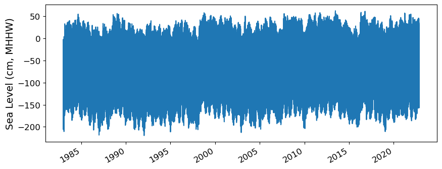
Fig. 2.1 Full time series at Malakal,Palau tide gauge for the entire record from 1969-05-18 to 2023-10-31. Note that the sea level is plotted in units of cm, relative to MHHW.#
2.2.3. Adjust the data from calendar year to storm year#
Storm year goes from May-April. Need to consult with Ayesha about this.
hourly_data['day'] = (('time'), hourly_data.time.dt.dayofyear.data)
hourly_data['month'] = (('time'), hourly_data.time.dt.month.data)
hourly_data['year'] = (('time'), hourly_data.time.dt.year.data)

# adjust year to storm year, where the storm year starts on May 1st
# if the month is less than 5, subtract a year
hourly_data['year_storm'] = (('time'), hourly_data.year.data - (hourly_data.month.data < 5))

hourly_data['year_storm'] = hourly_data['year_storm'].astype(int)

hourly_data['year_storm'].values

# get the year_storm value for April 15, 1997
hourly_data.sel(time='1997-04-15')
<xarray.Dataset>
Dimensions:               (record_id: 1, time: 24)
Coordinates:
  * time                  (time) datetime64[ns] 1997-04-15 ... 1997-04-15T22:...
  * record_id             (record_id) int16 70
Data variables: (12/15)
    sea_level             (record_id, time) float64 -758.0 -646.0 ... -959.0
    lat                   (record_id) float32 ...
    lon                   (record_id) float32 ...
    station_name          (record_id) |S7 b'Malakal'
    station_country       (record_id) |S5 b'Palau'
    station_country_code  (record_id) float32 ...
    ...                    ...
    last_rq_date          (record_id) datetime64[ns] ...
    datum                 float64 2.162e+03
    day                   (time) int64 105 105 105 105 105 ... 105 105 105 105
    month                 (time) int64 4 4 4 4 4 4 4 4 4 4 ... 4 4 4 4 4 4 4 4 4
    year                  (time) int64 1997 1997 1997 1997 ... 1997 1997 1997
    year_storm            (time) int64 1996 1996 1996 1996 ... 1996 1996 1996
Attributes:
    title:                  UHSLC Fast Delivery Tide Gauge Data (hourly)
    ncei_template_version:  NCEI_NetCDF_TimeSeries_Orthogonal_Template_v2.0
    featureType:            timeSeries
    Conventions:            CF-1.6, ACDD-1.3
    date_created:           2023-12-07T14:34:12Z
    publisher_name:         University of Hawaii Sea Level Center (UHSLC)
    publisher_email:        philiprt@hawaii.edu, markm@soest.hawaii.edu
    publisher_url:          http://uhslc.soest.hawaii.edu
    summary:                The UHSLC assembles and distributes the Fast Deli...
    processing_level:       Fast Delivery (FD) data undergo a level 1 quality...
acknowledgment: The UHSLC Fast Delivery database is supported by ...2.2.4. Assign a Threshold#
The threshold used here to determine a flood event is 30 cm above MHHW.
threshold = 30 # in cm
glue("threshold",threshold,display=False)

hourly_data
<xarray.Dataset>
Dimensions:               (record_id: 1, time: 349489)
Coordinates:
  * time                  (time) datetime64[ns] 1983-01-01 ... 2022-11-14
  * record_id             (record_id) int16 70
Data variables: (12/15)
    sea_level             (record_id, time) float64 -251.0 -401.0 ... -373.0
    lat                   (record_id) float32 ...
    lon                   (record_id) float32 ...
    station_name          (record_id) |S7 b'Malakal'
    station_country       (record_id) |S5 b'Palau'
    station_country_code  (record_id) float32 ...
    ...                    ...
    last_rq_date          (record_id) datetime64[ns] ...
    datum                 float64 2.162e+03
    day                   (time) int64 1 1 1 1 1 1 1 ... 317 317 317 317 317 318
    month                 (time) int64 1 1 1 1 1 1 1 1 ... 11 11 11 11 11 11 11
    year                  (time) int64 1983 1983 1983 1983 ... 2022 2022 2022
    year_storm            (time) int64 1982 1982 1982 1982 ... 2022 2022 2022
Attributes:
    title:                  UHSLC Fast Delivery Tide Gauge Data (hourly)
    ncei_template_version:  NCEI_NetCDF_TimeSeries_Orthogonal_Template_v2.0
    featureType:            timeSeries
    Conventions:            CF-1.6, ACDD-1.3
    date_created:           2023-12-07T14:34:12Z
    publisher_name:         University of Hawaii Sea Level Center (UHSLC)
    publisher_email:        philiprt@hawaii.edu, markm@soest.hawaii.edu
    publisher_url:          http://uhslc.soest.hawaii.edu
    summary:                The UHSLC assembles and distributes the Fast Deli...
    processing_level:       Fast Delivery (FD) data undergo a level 1 quality...
acknowledgment: The UHSLC Fast Delivery database is supported by ...# Assuming year_storm is created from the 'time' column
hourly_data['year_storm'] = hourly_data['time'].dt.year
hourly_data['year_storm'] = hourly_data['year_storm'].astype(int)
2.3. Calculate and Plot Flood Frequency#
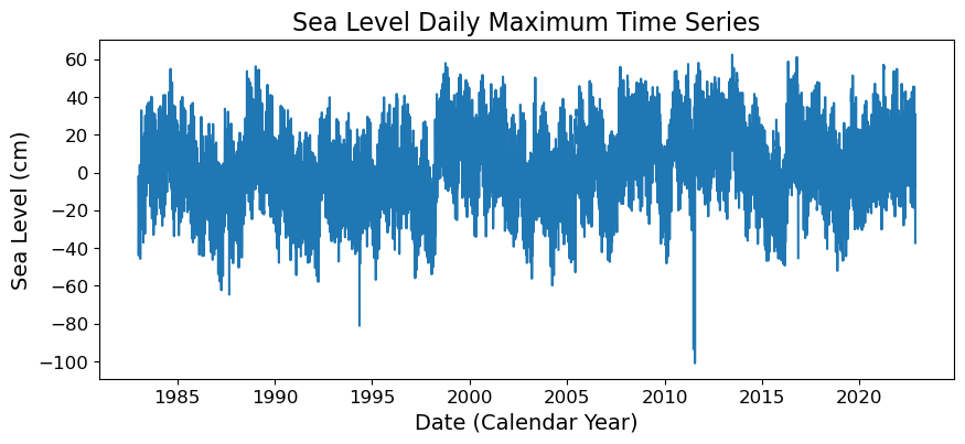
To analyze flood frequency, we will look for daily maximum sea levels for each day in our dataset, following Thompson et al. [TWM+19] and others. Then, we can group our data by year and month to visualize temporal patterns in daily SWL exceedance.
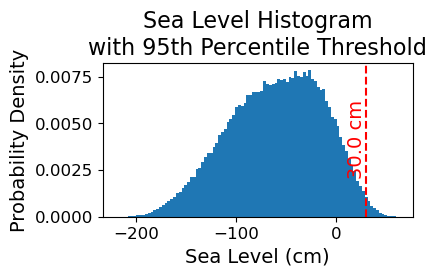
Fig. 2.2 Histogram of daily maximum water levels at Malakal,Palau tide gauge for the entire record from 1983-01-01 to 2022-11-14, relative to . The dashed red line indicates the chosen threshold of 30 cm.#
# Resample the hourly data to daily maximum sea level
SL_daily_max = hourly_data.resample(time='D').max()
SL_daily_max
<xarray.Dataset>
Dimensions:               (time: 14563, record_id: 1)
Coordinates:
  * record_id             (record_id) int16 70
  * time                  (time) datetime64[ns] 1983-01-01 ... 2022-11-14
Data variables: (12/15)
    sea_level             (time, record_id) float64 -23.0 -109.0 ... 1.0 -373.0
    lat                   (time, record_id) float32 7.33 7.33 7.33 ... 7.33 7.33
    lon                   (time, record_id) float32 134.5 134.5 ... 134.5 134.5
    station_name          (time, record_id) |S7 b'Malakal' ... b'Malakal'
    station_country       (time, record_id) |S5 b'Palau' b'Palau' ... b'Palau'
    station_country_code  (time, record_id) float32 585.0 585.0 ... 585.0 585.0
    ...                    ...
    last_rq_date          (time, record_id) datetime64[ns] 2018-12-31T22:59:5...
    datum                 (time) float64 2.162e+03 2.162e+03 ... 2.162e+03
    day                   (time) int64 1 2 3 4 5 6 7 ... 313 314 315 316 317 318
    month                 (time) int64 1 1 1 1 1 1 1 1 ... 11 11 11 11 11 11 11
    year                  (time) int64 1983 1983 1983 1983 ... 2022 2022 2022
    year_storm            (time) int64 1983 1983 1983 1983 ... 2022 2022 2022
Attributes:
    title:                  UHSLC Fast Delivery Tide Gauge Data (hourly)
    ncei_template_version:  NCEI_NetCDF_TimeSeries_Orthogonal_Template_v2.0
    featureType:            timeSeries
    Conventions:            CF-1.6, ACDD-1.3
    date_created:           2023-12-07T14:34:12Z
    publisher_name:         University of Hawaii Sea Level Center (UHSLC)
    publisher_email:        philiprt@hawaii.edu, markm@soest.hawaii.edu
    publisher_url:          http://uhslc.soest.hawaii.edu
    summary:                The UHSLC assembles and distributes the Fast Deli...
    processing_level:       Fast Delivery (FD) data undergo a level 1 quality...
acknowledgment: The UHSLC Fast Delivery database is supported by ...# make a new figure that is 15 x 5
fig, ax = plt.subplots(sharex=True)
plt.plot(SL_daily_max.time.values, SL_daily_max.sea_level.values/10)
plt.xlabel('Date (Calendar Year)')
plt.ylabel('Sea Level (cm)')
plt.title('Sea Level Daily Maximum Time Series')
Text(0.5, 1.0, 'Sea Level Daily Maximum Time Series')
# Make a pdf of the data with 95th percentile threshold

sea_level_data_cm = hourly_data['sea_level'].values/10 # convert to cm
#remove nans
sea_level_data_cm = sea_level_data_cm[~np.isnan(sea_level_data_cm)]

fig, ax = plt.subplots(figsize=(4,2))
ax.hist(sea_level_data_cm, bins=100, density=True, label='Sea Level Data')

ax.axvline(threshold, color='r', linestyle='--', label='Threshold: {:.4f} cm'.format(threshold))
ax.set_xlabel('Sea Level (cm)')
ax.set_ylabel('Probability Density')
# make the title two lines
ax.set_title('Sea Level Histogram\nwith 95th Percentile Threshold')

# add label to dashed line
# get value of middle of y-axis for label placement
ymin, ymax = ax.get_ylim()
yrange = ymax - ymin
y_middle = ymin + yrange/2

ax.text(threshold, y_middle, '{:.1f} cm'.format(threshold), rotation=90, va='center', ha='right', color='r')
glue("histogram_fig", fig, display=False)
Show code cell output
# Find all days where sea level exceeds the threshold
flood_day = (SL_daily_max.sea_level > threshold)

SL_daily_max['flood_day'] = flood_day

# Filtering the dataset for flood hours and selecting relevant variables
flood_days_data = SL_daily_max.where(SL_daily_max.flood_day, drop=True)[['year_storm']]

# Converting the dataset to a DataFrame
flood_days_df = flood_days_data.to_dataframe().reset_index()

# Grouping by 'year_storm' and counting the number of flood days
flood_days_per_year = flood_days_df.groupby('year_storm').size().reset_index(name='flood_days_count')
# Find all hours where sea level exceeds the threshold
flood_hour = (hourly_data.sea_level > threshold)

hourly_data['flood_hour'] = flood_hour

# Filtering the dataset for flood hours and selecting relevant variables
flood_hours_data = hourly_data.where(hourly_data.flood_hour, drop=True)[['year_storm']]

# Converting the dataset to a DataFrame
flood_hours_df = flood_hours_data.to_dataframe().reset_index()

# Grouping by 'year_storm' and counting the number of flood hours
flood_hours_per_year = flood_hours_df.groupby('year_storm').size().reset_index(name='flood_hours_count')
2.3.1. Plot Flood Frequency Counts#
The flood frequency counts are defined as the number of time periods that exceed a given threshold within a year. This plot follows Sweet et al. [SPM+14].
# Adjusting the heatmap palette to improve readability
adjusted_heatmap_palette = sns.color_palette("YlOrRd", as_cmap=True)
norm = plt.Normalize(flood_days_per_year['flood_days_count'].min(), flood_days_per_year['flood_days_count'].max())
colors = [adjusted_heatmap_palette(norm(value)) for value in flood_days_per_year['flood_days_count']]

# Plotting with the adjusted settings
fig, ax = plt.subplots()
ax = sns.barplot(
    x='year_storm',
    y='flood_days_count',
    hue='year_storm',
    data=flood_days_per_year,
    palette=colors,
    dodge=False,
    legend=False
)
ax.set_xticks(range(0, len(flood_days_per_year), 5))  # Setting x-ticks to show every 5th year
year_ticks = flood_days_per_year['year_storm'][::5].astype(int)  # Selecting every 5th year for the x-axis
ax.set_xticklabels(year_ticks, rotation=45)

# Adding a light gray grid
ax.grid(color='lightgray', linestyle='-', linewidth=0.5)

ax.set_xlabel('Storm Year')
ax.set_ylabel('Number of Flood Days')
ax.set_title('Number of Flood Days Per Year (Adjusted Heatmap Coloring)')

glue("threshold_counts_days_fig", fig, display=False)

# save the figure
fig.savefig(output_dir / 'SL_FloodFrequency_threshold_counts_days.png', bbox_inches='tight')
Show code cell output
Fig. 2.3 Flood frequency counts above a threshold of 30.000 cm per year at Malakal,Palau tide gauge from 1983-01-01 to 2022-11-14.#
2.3.2. Plot Flood Duration#
This next plot examines the average duration of flooding events as defined by the threshold. I have a few issues with this plot being “duration,” as it’s just counts of hours above the threshold. These hours need not be continuous…which to me is what duration is all about. Anyway, we carry on.
# This is the same as the previous cell, but with 'flood_hours_count' instead of 'flood_days_count' and 'flood_hours_per_year' instead of 'flood_days_per_year'. This is bad coding. I should have made a function to do this.
# But there are bigger fish to fry right now.


# Adjusting the heatmap palette to improve readability
adjusted_heatmap_palette = sns.color_palette("YlOrRd", as_cmap=True)
norm = plt.Normalize(flood_hours_per_year['flood_hours_count'].min(), flood_hours_per_year['flood_hours_count'].max())
colors = [adjusted_heatmap_palette(norm(value)) for value in flood_hours_per_year['flood_hours_count']]

# Plotting with the adjusted settings
fig, ax = plt.subplots()
ax = sns.barplot(
    x='year_storm',
    y='flood_hours_count',
    hue='year_storm',
    data=flood_hours_per_year,
    palette=colors,
    dodge=False,
    legend=False
)
ax.set_xticks(range(0, len(flood_hours_per_year), 5))  # Setting x-ticks to show every 5th year
year_ticks = flood_hours_per_year['year_storm'][::5].astype(int)  # Selecting every 5th year for the x-axis
ax.set_xticklabels(year_ticks, rotation=45)

# Adding a light gray grid
ax.grid(color='lightgray', linestyle='-', linewidth=0.5)

ax.set_xlabel('Storm Year')
ax.set_ylabel('Number of Flood Hours')
ax.set_title('Number of Flood Hours Per Year (Adjusted Heatmap Coloring)')

glue("duration_fig", fig, display=False)
Show code cell output
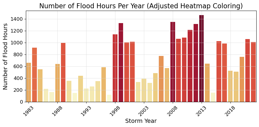
Fig. 2.4 Average flood duration in hours above a threshold of 30.000 cm per year at Malakal,Palau tide gauge from 1983-01-01 to 2022-11-14.#
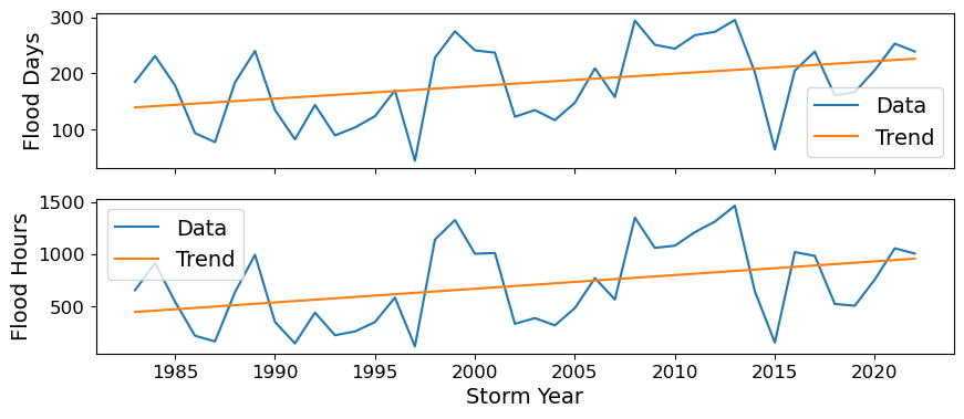
2.4. Calculate the percent change over time#
Next we’ll calculate the percent change over the POR at the tide station/s, for both Frequency and Duration.
The next code cell fits a trend line to the flood days per year data and calculates the trend line. It then plots the data and the trend line in a figure, and calculates the percent change in flood days per year using the trend line. The same process is repeated for flood hours per year.
"""

"""

slope, intercept, r_value, p_value, std_err = stats.linregress(flood_days_per_year['year_storm'], flood_days_per_year['flood_days_count'])
trend = intercept + slope * flood_days_per_year['year_storm']

fig, axs = plt.subplots(2,1)
axs[0].plot(flood_days_per_year['year_storm'], flood_days_per_year['flood_days_count'], label='Data')
axs[0].plot(flood_days_per_year['year_storm'], trend, label='Trend')
axs[0].set_ylabel('Flood Days')
axs[0].legend()
axs[0].set_xticklabels([])

glue("trend_fig", fig, display=False)

percent_change_days = (trend[-1:] - trend[0]) / trend[0] * 100
glue("percent_change_days", percent_change_days, display=False)
percent_change_days

slope, intercept, r_value, p_value, std_err = stats.linregress(flood_hours_per_year['year_storm'], flood_hours_per_year['flood_hours_count'])
trend = intercept + slope * flood_hours_per_year['year_storm']

axs[1].plot(flood_hours_per_year['year_storm'], flood_hours_per_year['flood_hours_count'], label='Data')
axs[1].plot(flood_hours_per_year['year_storm'], trend, label='Trend')
axs[1].set_xlabel('Storm Year')
axs[1].set_ylabel('Flood Hours')
axs[1].legend()

glue("trend_fig", fig, display=False)

percent_change_hours =  (trend[-1:]-trend[0])/trend[0]*100
glue("percent_change_hours", percent_change_hours, display=False)
percent_change_hours
39    113.806306
Name: year_storm, dtype: float64
Now we’ll generate a table with this information, which will be saved as a .csv in the output directory specified at the top of this notebook.
# make a dataframe with the percent change in flood days and hours per year, with given threshold
percent_change_df = pd.DataFrame({'percent_change_days': percent_change_days.values[0], 'percent_change_hours': percent_change_hours.values[0], 'threshold': threshold}, index=[0])

# add the station name and country
percent_change_df['station'] = station
percent_change_df['country'] = country

# reorder the columns
percent_change_df = percent_change_df[['station', 'country', 'threshold', 'percent_change_days', 'percent_change_hours']]

# Define your attributes
attributes = {
    'station': 'Station name',
    'country': 'Country name',
    'threshold': 'Threshold in cm above MHHW',
    'percent_change_days': 'Percent change in flood days per year',
    'percent_change_hours': 'Percent change in flood hours per year'
}

# Open the file in write mode
with open(output_dir / 'SL_FloodFrequency_percent_change.csv', 'w') as f:
    # Write the attributes as comments
    for column, attribute in attributes.items():
        f.write(f'# {column}: {attribute}\n')

    # Write the DataFrame to the file
    percent_change_df.to_csv(f, index=False)

percent_change_df
| station | country | threshold | percent_change_days | percent_change_hours | |
|---|---|---|---|---|---|
| 0 | Malakal | Palau | 30 | 61.836836 | 113.806306 |
2.5. Create a map#
In this next section we’ll create a map with an icon depicting the percent change over the Period of Record at the tide station/s, for both Frequency and Duration.
The following cell defines a function that creates a “zebra stripe” pattern for the map borders.
Show code cell source
def add_zebra_frame(ax, lw=2, segment_length=0.5, crs=ccrs.PlateCarree()):
    # Get the current extent of the map
    left, right, bot, top = ax.get_extent(crs=crs)

    # Calculate the nearest 0 or 0.5 degree mark within the current extent
    left_start = left - left % segment_length
    bot_start = bot - bot % segment_length

    # Adjust the start if it does not align with the desired segment start
    if left % segment_length >= segment_length / 2:
        left_start += segment_length
    if bot % segment_length >= segment_length / 2:
        bot_start += segment_length

    # Extend the frame slightly beyond the map extent to ensure full coverage
    right_end = right + (segment_length - right % segment_length)
    top_end = top + (segment_length - top % segment_length)

    # Calculate the number of segments needed for each side
    num_segments_x = int(np.ceil((right_end - left_start) / segment_length))
    num_segments_y = int(np.ceil((top_end - bot_start) / segment_length))

    # Draw horizontal stripes at the top and bottom
    for i in range(num_segments_x):
        color = 'black' if (left_start + i * segment_length) % (2 * segment_length) == 0 else 'white'
        start_x = left_start + i * segment_length
        end_x = start_x + segment_length
        ax.hlines([bot, top], start_x, end_x, colors=color, linewidth=lw, transform=crs)

    # Draw vertical stripes on the left and right
    for j in range(num_segments_y):
        color = 'black' if (bot_start + j * segment_length) % (2 * segment_length) == 0 else 'white'
        start_y = bot_start + j * segment_length
        end_y = start_y + segment_length
        ax.vlines([left, right], start_y, end_y, colors=color, linewidth=lw, transform=crs)
The following cell defines a function to implement the zebra stripes on a given axis.
Show code cell source
def plot_zebra_frame(ax, lw=5, segment_length=2, crs=ccrs.PlateCarree()):
    """
    Plot a zebra frame on the given axes.

    Parameters:
    - ax: The axes object on which to plot the zebra frame.
    - lw: The line width of the zebra frame. Default is 5.
    - segment_length: The length of each segment in the zebra frame. Default is 2.
    - crs: The coordinate reference system of the axes. Default is ccrs.PlateCarree().
    """
    # Call the function to add the zebra frame
    add_zebra_frame(ax=ax, lw=lw, segment_length=segment_length, crs=crs)
    # add map grid
    gl = ax.gridlines(draw_labels=True, linestyle=':', color='black',
                      alpha=0.5,xlocs=ax.get_xticks(),ylocs=ax.get_yticks())
    #remove labels from top and right axes
    gl.top_labels = False
    gl.right_labels = False
The following cell defines a function to add arrow icons denoting percent change.
Show code cell source
# make a function for adding the arrows
def add_arrow(ax, lat,lon,percent_change,crs, vmin, vmax):
# make colormap of percent change
    adjusted_heatmap_palette = sns.color_palette("YlOrRd", as_cmap=True)

    # Prepare data for quiver plot
    U = np.zeros_like(lon)  # Dummy U component (no horizontal movement)
    V = percent_change/100   # V component scaled by percent change
    arrow_scale = 5  # Adjust as necessary for arrow size
    arrow_width = 0.01  # Adjust for desired arrow thickness

    # Quiver plot
    q = ax.quiver(lon,lat, U, V, transform=crs, scale=arrow_scale,
              color=adjusted_heatmap_palette(percent_change.values / vmax),
              cmap=adjusted_heatmap_palette, clim=(vmin, vmax), width=arrow_width)
And here is our final plotting code:
xlims = [128, 138]
ylims = [0, 13]
vmin, vmax = 0,100

# fig, ax, crs,cmap = plot_map(vmin,vmax,xlims,ylims)
crs = ccrs.PlateCarree()
fig, axs = plt.subplots(1, 2, figsize=(10, 6), subplot_kw={'projection': crs})


for i, ax in enumerate(axs):
    ax.set_xlim(xlims)
    ax.set_ylim(ylims)

    ax.coastlines()

    # Fill in water
    ax.add_feature(cfeature.LAND, color='lightgrey')
    # add a) b) labels
    ax.text(0.95, 0.95, f'({chr(97 + i)})',
            horizontalalignment='right', verticalalignment='top', transform=ax.transAxes,
            fontsize=16)

    ax.add_feature(cfeature.OCEAN, color='lightblue')

    # add map grid
    gl = ax.gridlines(draw_labels=True, linestyle=':', color='black',
                  alpha=0.5,xlocs=ax.get_xticks(),ylocs=ax.get_yticks())

    #remove labels from top and right axes
    gl.top_labels = False
    gl.right_labels = False

    if ax == axs[1]:
        gl.left_labels = False

add_arrow(axs[0], rsl['lat'], rsl['lon'], percent_change_days, crs, vmin, vmax)
add_arrow(axs[1], rsl['lat'], rsl['lon'], percent_change_hours, crs, vmin, vmax)

# Plot zebra frame
# plot_zebra_frame(axs[0], lw=5, segment_length=2, crs=crs)
# plot_zebra_frame(axs[1], lw=5, segment_length=2, crs=crs)

# Add text for percent change
for i in range(len(rsl['lon'])):
    axs[0].text(rsl['lon'][i] + 0.25, rsl['lat'][i] + 0.25, '{:.1f}%'.format(percent_change_days.values[0]), fontsize=14,
                color=adjusted_heatmap_palette(percent_change_days.values / vmax))
    axs[1].text(rsl['lon'][i] + 0.25, rsl['lat'][i] + 0.25, '{:.1f}%'.format(percent_change_hours.values[0]), fontsize=14,
                color=adjusted_heatmap_palette(percent_change_hours.values / vmax))


glue("mag_fig", fig, display=False)

# Save the figure
output_file_path = output_dir / 'SL_FloodFrequency_map.png'
fig.savefig(output_file_path, dpi=300, bbox_inches='tight')
Show code cell output
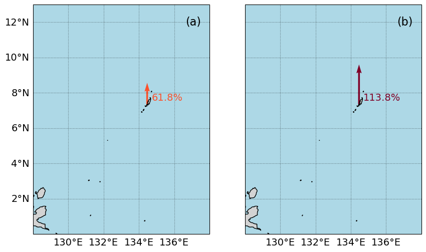
Fig. 2.5 Map of the percent change in average flood (a) days and (b) hours per year above a threshold of 30.0 cm above MHHW per year at Malakal,Palau tide gauge from 1983-01-01 to 2022-11-14#
2.6. Citations#
- SPM+14
William Sweet, Joseph Park, John Marra, Chris Zervas, and Stephen Gill. Sea level rise and nuisance flood frequency changes around the United States. Technical Report, NOAA, 2014. URL: https://repository.library.noaa.gov/view/noaa/30823.
- TWM+19
Philip R. Thompson, Matthew J. Widlansky, Mark A. Merrifield, Janet M. Becker, and John J. Marra. A Statistical Model for Frequency of Coastal Flooding in Honolulu, Hawaii, During the 21st Century. Journal of Geophysical Research: Oceans, 124(4):2787–2802, 2019. URL: https://onlinelibrary.wiley.com/doi/abs/10.1029/2018JC014741, doi:10.1029/2018JC014741.